Product Animation Ads - 686 and Bellroy Ads Review
Welcome back to another edition of my weekly digital advertising review. I round up the best digital ads I can find, host them on my website, and review them for your education.
This week we’re reviewing 3 product animation ads. We have 1 from outdoor wear company 686, and 2 more from bag company Bellroy. These ads are all completely product-focused, meaning they have no lifestyle elements, and they all use stop-motion style animation to achieve an interesting look. Check them out, then I’ll break own why these ads work, and share a few ideas to make them better.

Why These Ads Work
Lively animation
All of these ads use a lively animation style to bring their products to life. Any product-focused ad has one main goal: to get you to look at the product. These ads are particularly successful in achieving that goal because the animation style holds your attention. Almost any single frame of these ads could be run as a simple product photo ad, but the creators didn’t stop there. The video animation draws the viewer’s eye to the right things at the right time. Even the most beautiful possible product photo would be hard pressed to keep consumers’ eyes on the product for as long as these animations do.
Product features
These ads aren’t just fun–they’re strategic. They all show off different features at the right time to educate customers on what the products can do. The 686 ad first shows the stylistic versatility of the pants, then it shows 5 main product features close up. After watching this ad, the viewer has a great idea of what the pants can do, and has spent 30 seconds looking at the product.
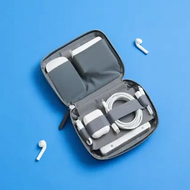
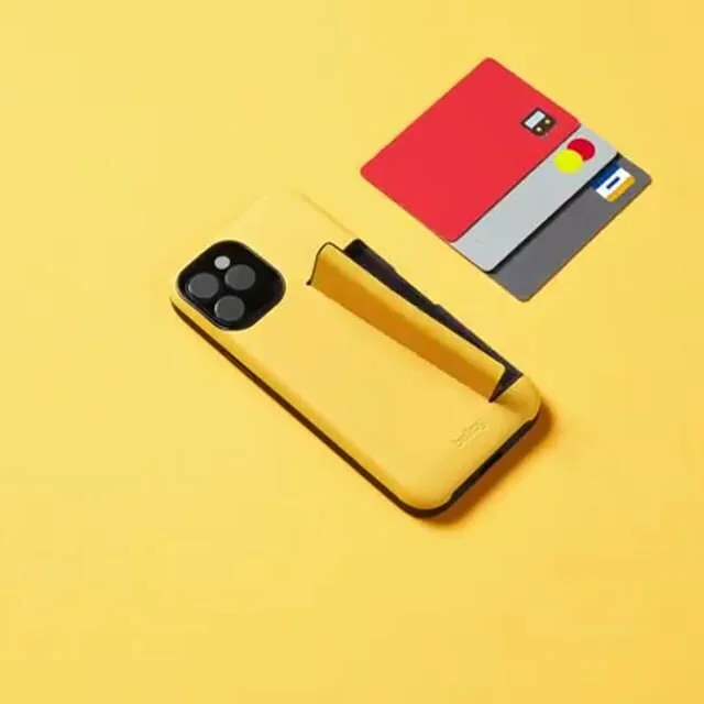
The Bellroy phone case ad shows all the available colors, the credit card slot, and the phone stand feature back-to-back-to-back. Their Tech Kit ad shows all the available products it can hold, drawing your eye back and forth to each one.
Ideas for improvement
686 Ad
While the 686 pants ad was very well executed, I have a few ideas for improvement.
Uniform Aesthetic
Aesthetically, I’m not a huge fan of the switch between the lay-down shots, and the spinning pants shots. The lay-down shots are fun and light, while the spinning shots are dramatic and serious. The back and forth between them kills the mood for me. My suggestion would be to integrate the product feature callouts from the spinning shots into the lay-down shots. What if the lay-down shots punched in close to show the product features that go along with each style? The stretch feature could be associated with the climbing outfit, the credit card feature with the work outfit, the water resistant feature with the hiking outfit, and so on.
Shorter edit
For a social media ad, 30 seconds is pretty long. My suggestion is to shorten the ad by 10 seconds or so, which would greatly increase retention. It’s always better to leave the customer wanting more than to leave them bored. As advertisers, sometimes we get big heads and think no one could be bored by our brilliant ads. This isn’t the case. Shorter ads might not get everything you want across, but if you spark curiosity, they’ll click.
Bellroy ads
Aesthetically, the Bellroy ads are beautiful. I discussed this in my previous post about the Bellroy Wallet Comparison Ad, but they’re obviously very brand-focused on The Marketing Spectrum. My suggestion here would be to out a call-to-action on their ads. Even something cool and simple could help drive more traffic like “Get Your Tech Together” or “Get A Helpful Phone Case.”
Closing
All in all, these are great ads. If you’re thinking of running a photo-based product ad, start think about how a little animation could go a long way.
Good luck out there!