Ads Review - Comparison Photo Ads
Welcome to the Ads Review. This is a new series in which I’ll review the best ads I can find. Most of the ads I review will be digitally native–meaning they’re designed for social.
Social media has ushered us into a new age of advertising. In most cases, consumers can choose to skip or scroll past digital ads. When this is the case, advertisers have to be savvy, and very concise. Delivering the message within a few seconds is crucial.
The first set of ads I will review are comparison photo ads. These ads compare the status quo to a new way of doing things. Let’s jump in.
Bellroy

Bellroy is a direct-to-consumer bag company with a minimalist design, and a killer ads team. They make a full range of “bags” to carry everyday items–from backpacks, to crossbody bags, to wallets.
This simple comparison photo ad shows the differences between the typical male wallet, and Bellroy’s slimmed down wallet.
Why this works
Right off the bat, you know exactly what this ad is about: getting a slimmer wallet. Even in a high-speed social scrolling session, the mind would identify these two objects as wallets, and decide that the Bellroy wallet is better.
The reason the mind would see the Bellroy as better is subtle. First, the brown wallet has a stack of cards, but they’re not perfectly aligned. The Bellroy wallet’s cards are perfectly aligned. Second, the brown wallet has corners of dollar bills hanging out the side. The Bellroy wallet doesn’t have cash sticking out. Finally, the brown wallet is ever so slightly frayed on the edges and corners. The Bellroy is brand new.
There are a thousand ways to do comparison ads. The most painful versions are classic infomercials. Infomercials usually begin with black and white videos of people with frizzy hair dropping things. These are grossly unrealistic, and are far too “used car salesman” for a modern direct-to-consumer brand. But in the end, Bellroy uses the same principles and just tones them way down.
The brand name placement ties a bow on this ad. This ad doesn’t have a strong call-to-action, so it’s less likely to drive traffic compared to other ads. However, Bellroy doesn’t miss the opportunity to place their brand name as the solution.
Ideas to make it better
In order to increase brand lift, I would suggest using bold text on the word “Bellroy”. Bellroy’s brand image is a very strong value in all their marketing. They seem unwilling to sacrifice their minimalist design to churn a few more sales each week. While many brands would probably write their name in all-caps, use their logo, or highlight it with a different color (none of which I would recommend), this obviously isn’t Bellroy’s style. Bold text would remain on brand, and draw the eye to the brand name.
My only other idea to make this ad better is to change the check mark color to a pastel green. This leans a little bit more to the performance side of The Marketing Spectrum, but with the right color, I think it would still be palatable. This would help the mind identify the ideal product quicker, and create another subconscious positive connection with the Bellroy wallet.
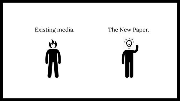
The New Paper

The New Paper is an email and text message based bullet point news roundup that syndicates every weekday. They charge a nominal monthly fee to keep their service ad-free. This helps them remain 100% unbiased and newsworthy. No click bait here.
Why This Works
I know this ad works. How? It worked on me. I was on a production in New York City with Etihad Airways, standing on the Brooklyn Bridge as Jacob Riglin snapped photos when I saw this ad. (Yes, I was scrolling Instagram on set.) I immediately clicked, pulled out my credit card, and signed up. That was in September of 2019, and they’re still running this ad.
The execution of this ad is elegant, which is crazy to say about a design with large scribbles. This ad perfectly sums up how so many feel about the biased 24-hour news cycle, and it provides a solution. This ad isn’t for everyone–mainstream news junkies probably wouldn’t be targeted here. But for people who feel they should be more informed, but can’t lower themselves to the level of existing media, this ad is therapy.
The design is smart. The graphics perfectly display the progression from stress to clarity. The typeface tips its cap to trustworthy news. Similar to Bellroy’s approach, the brand name is positioned as the solution.
Ideas to make it better
The only ideas I have to make this ad better are to experiment with caption variations. I’m sure The New Paper is doing this. Captions like “unbiased, ad-free news for free-thinking people”, or “an ad-free news roundup texted to you every weekday” could work well.
Other versions
Here are two other versions that the new paper is running with a similar concept. In my opinion, these ads are less effective because they’re less subtle, but I don’t have any information on their top performing ads.

Closing
Comparison ads are a fantastic approach, and a great starting point for any ads package. Brands spend so much time trying to differentiate by calling out product features, design variations, or mission statements. In the end, smart design and a simple comparison can go a long way to position your product in the minds of consumers.
Good luck out there!